Making Sense of Different Org Chart Formats
What's the best org chart format for your needs - static, interactive, live, or hardcopy? This post breaks down the pros and cons of different org chart styles to help you decide.

Org charts come in many different shapes and sizes and their formatting options are no different.
In this post, I’ll break down the main types of org chart formats to give you a better handle on the strengths and weaknesses of each style. Whether you need a simple black-and-white hierarchical structure or a fully interactive digital org chart with all the bells and whistles, I’ve got you covered.
By the end, you’ll understand the pros and cons of static charts, dynamic live charts, interactive diagrams, and even good old-fashioned paper charts. Armed with this knowledge, you can decide what works for your company.
Sound useful? Then let’s get started!
Keeping it Old School with Hardcopy Org Charts
In the digital age, we often forget about good old hardcopy org charts. You know, the kind neatly printed on large posters or fold-out brochures. They may seem old-fashioned, but you would be surprised how many organizations still use them.
Hardcopy charts have stood the test of time for some solid reasons:
- It's a tangible item that people can reference
- Easy to highlight key areas or make notes on
- Staff without computer access can still view
- Formats like large posters guarantee visibility
Of course, paper charts share common downsides with static ones:
- Manual updates mean frequent revisions
- Can get damaged over time
- Not environmentally friendly
- Limited ability to drill deeper into details
When is a paper org chart the way to go? Usage cases might include:
- Posting in manufacturing production areas
- Providing as part of new hire onboarding
- Sharing across virtual teams at annual meetings
- Giving to executives as a quick reference
While not as flashy as digital formats, good old paper org charts still deliver core value. They won’t win any innovation awards but they remain a clear, tangible way to communicate organizational structures.
The Lowdown on Static Org Charts
Traditional or “static” org charts display an organization’s structure at a single moment in time. They show the broad relationships between positions, departments, managers, and executives using basic shapes and straight lines.
Static org charts have a simple, almost old-school look. You’ve likely seen plenty posted in break rooms or buried somewhere on a company intranet site. Their no-frills style has some benefits:
- Easy to create and share
- Provide a quick overview at-a-glance
- Work for documenting basic reporting structures
But static charts also have some real limitations:
- Quickly become outdated
- Don’t show how teams collaborate
- Can hide the underlying complexity of roles and responsibilities
While they serve a purpose, in today’s ever-changing business environment, traditional org charts often create more questions than answers.
The Promise and Peril of Live Org Charts
Unlike their static siblings, live org charts display real-time information pulled straight from a company directory or HR database. As the organization evolves, so too does the chart.
Think about that for a second. Who reports to whom? What positions are open or filled? It’s all right there in living color. Talk about a real-time view of a company’s processes and people.
Some obvious advantages:
- No manual updates needed
- Changes happen instantly
- Greater transparency for staff
But beware — with great power comes great responsibility! Dynamic org charts pose some risks:
- Potential to expose sensitive info
- Requires planning for access control
- Can get messy as roles shift
If you go the live route, take steps to lock down confidential stuff concerning salaries, disciplinary issues, or upcoming re-org. The last thing you want is to inadvertently create internal chaos.
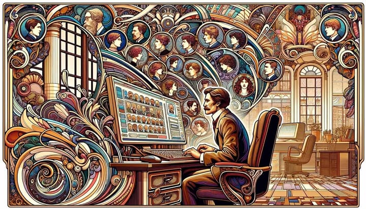
Harnessing the Power of Interactive Org Charts
Interactive org charts aim to provide the best of both worlds — real-time data in an easy-to-digest format. These feature-rich charts allow users to engage directly with the information displayed.
We’re talking drill-downs into deeper team structures, custom views by location or department, and mouse-over pop-ups showing quick stats on various positions.
Other advanced features may include:
- Employee contact info and biographies
- Photos, videos, and social profiles
- Current open headcounts by team
- Links to succession plans
By blending dynamic data with user customization options, interactive charts create a more engaging experience. Your people get clarity into the teams around them while strengthening connections across the business.
However, going overboard on features can make these charts overwhelming to navigate day-to-day. Don’t underestimate the effort involved in implementing and maintaining one. It’s no small task.
Key Takeaways on Org Chart Options
Let’s recap what we just covered:
- Hard copy and static org charts are simple to create but quickly become stale
- Live charts stay fresh but risk exposing sensitive info
- Interactive charts drive engagement but can get complicated
As with most things in business, there are always trade-offs. Your unique needs should drive which option fits best. No matter what format you select, communicate changes clearly and keep that org chart updated regularly.